grammar terms are indistinguishable from defined terms #323
Comments
|
I would be happy to take this, but I'll need guidance from the group as to what font to use. |
|
Chosen approach is to change grammar terms to be sans serif slanted (\sffamily, \textsf). |
|
This depends on #701. |
|
Sans-serif (whether slanted or upright) wouldn't be a terrible solution. Maybe we could test-drive that change and see how we feel about it. Sample boards welcome. |
|
Now that #701 is addressed, we can make progress here. A sample for [class] is attached. Note p5, where we have all the different typefaces in one sentence.
|

|
I like it. |
|
Just playing with
|

|
Well... I just had a look at the \tcolorbox manual, and the table of contents looks ... wow. I think the fundamental question here is whether we want to leave the realm of traditional black-on-white printer-style typesetting or not. (Maybe ISO Central Secretariat has an opinion, too.) If the former, we should (for example) consider boxing all the examples and notes, as well as the grammar snippets and the itemdecls. At the current state of black-on-white, boxing the \grammarterms (and nothing else) seems misguided to me, and hurts my eyes: "Here is a large blue boxed \grammarterm. Better pay attention. We will throw it right in your face. But we didn't bother to box the grammar definitions, sorry about that." |
|
I think the typographical principle of minimal distinction applies here: if we're changing the typeface, then we don't also need to make it italic. Try just upright sans-serif for the grammar terms, I bet that looks good, too. |
|
Here you are ("opt" probably needs some love + care):
|

|
(Could you perhaps make slightly higher-resolution screenshots? Check out how zygoloid makes them.) |
|
Here you are:
|

|
I'm afraid I don't like it as much as the slanted form. The transition between typefaces looks really jarring, almost as if the grammar names and extracts are screenshots of some other document. (I'm not sure why I don't get the same impression from the slanted form.) And conversely, the transition in typeface between the end of a grammar term and a following "s" is not distinctive enough to give a clear transition between the grammar term and the suffix. |
|
Yes, I agree that the distinction is ultimately too subtle to be effective. |
|
You might try small caps ( |
|
@godbyk: I like that idea! Not only does it allow us to not introduce a new typeface, but it also plays more nicely with the start of sentences. Though that said, I'm now wondering whether we shouldn't use small-caps for definitions and retain the familiar italics for grammar terms! |
|
Note, though, that it is still difficult to distinguish between a |
|
For completeness, here's a version with
|

|
@jensmaurer: What about the other way round, use small caps for definitions? |

|
@jensmaurer: I don't think any font change is imminent at this point :-) I do quite like small caps for definitions. I'm not all that fond of small caps for grammar terms. Grammar terms get repeated, and I quite like our existing italics. Definitions appear only once, so I can get behind using small caps there -- there's a fair bit of typographic tradition for that, too. |
|
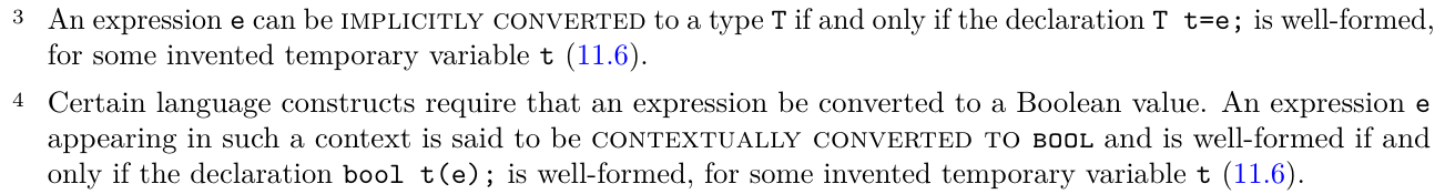
How does the small-caps-for-definitions look for "contextually converted to |
|
We also tried bold for definitions, which doesn't really work because the weight of the bold font is too close to that of teletype. My preference currently is small-caps for definitions. We should also stop using small-caps for NTBS, except in the definition of it. (Note that using small-caps for NTBS means that search for "NTBS" in some PDF viewers doesn't find it! This switches from a bug into a feature when used for defined terms.) |
|
Editorial meeting consensus: we explored several options, and even though we could pursue any one of them (with small caps definitions being the most popular), there's a big cost of upsetting the status quo and the familiarity of the many users of the standard. The issue is ultimately not all that pressing. Several other language specifications use a similar style to ours, and it's good enough. In many cases, grammar terms have peculiar spelling (e.g. hyphens) that makes them quite obvious, and so we consider the status quo good enough for the time being. |
|
Editorial teleconference: New motivation for addressing this presented in #3197. |
|
@jensmaurer Ping #323 (comment) for the italic-sans? |
|
Editorial meeting: This looks good, better than the status quo: \definecolor{light-gray}{gray}{0.2} looks reasonable, except for the absence of italics correction (visible for trailing "s"). Keep standard black for BNF blocks. |
This issues was raised by Gaby - that you can't tell definitions from grammar terms, because both are italics. Maybe use _bold italics_ for one of those - like the definition?
The text was updated successfully, but these errors were encountered: